

“How’d the market do today?”
The answer depends on whom you ask. There is a certain generation (hint: “OK, boomer”) that references the Dow Jones as their barometer for assessing the performance of the stock market, while subsequent generations have come to accept the S&P 500 Index as that market proxy. The two market indexes offer distinct differences in their composition and methodology. Great analysis can be found on the S&P Dow Jones website.
Let’s dissect.
The Dow traces its history back to 1896 and consists of 30 well-established companies from various sectors of the U.S. economy. The selection of those companies is not governed by a set of rules but by a committee from the S&P Dow Jones Indices and the Wall Street Journal. They consider US firms with an “excellent reputation” and a capacity for sustained growth. Uh, got it.
The Dow is a price-weighted index, meaning that the higher the stock price of the component, the greater its influence on the index movements. Case in point: United Healthcare (UNH) is trading around a share price of $487, Apple (AAPL) is trading at $174. UNH has a 9.1% weight while AAPL is 3.3%, despite Apple being worth 5x United Healthcare. It’s quirky!
Contrast the Dow to the S&P 500 Index, which is a broader representation of the 500 largest companies in the US. It’s a powerhouse index that has spawned over $7 trillion (with a T!) managed in investment products purely designed to track it.
Unlike the artisanal-crafted Dow, the S&P 500 components follow a strict selection criterion, and the index is market-cap weighted, where the weight of each component is determined by its market capitalization (price multiplied by the number of shares). The bigger the company, the bigger the representative weighting. In the S&P 500 Index, Apple has a 6.9% weight, while UNH is at 1.2%. That feels right.
Is there a resemblance in returns?
So, we have a 30-stock boomer index discretionally managed in secrecy vs. a methodical, 500-stock millennial index running proportionally on the backs of the largest US companies. The historical returns of these two must be vastly different, right? Let’s roll the tape.
Cumulative Returns of Dow Jones vs. S&P 500 Index
1980–Today
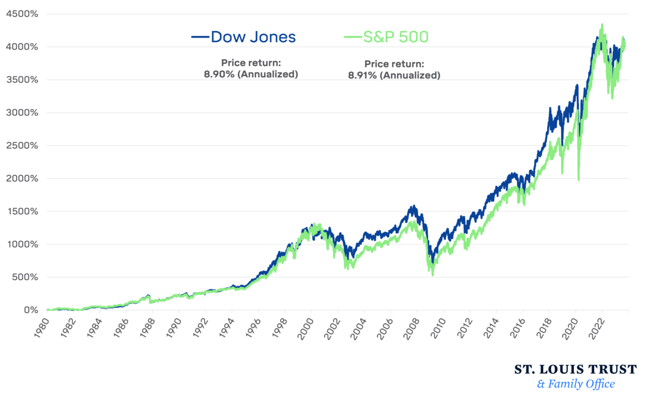
The chart above shows the path of cumulative price returns for the Dow Jones and S&P 500 indices starting from the beginning of 1980, or when that first millennial rolled off the assembly line. Surprisingly, the Dow has returned an annualized 8.9% over this period while the S&P 500 logged a nearly identical 8.91% price return. Wait, what?
You can certainly find distinct periods of time when these two indexes didn’t have their performance match up—the S&P 500 had a better tech bubble run-up and post-COVID surge—but the performance journey doesn’t seem that markedly different.
There are two investor takeaways I’d like to think resonate here: (1) respect your elders, for their market gods are nothing to be discarded (OK, boomer!), and (2) the concept of diversification in large US enterprises is perhaps more important than the composition.
Enjoy following whatever “market” you choose!
